Visualizing datasets, storytelling and Tableau

ANLY-503: Advanced Data Visualization

Where we’ve been

Code
library(dplyr)
library(ggplot2)
data(msleep)
  • A mental model for creating data visualizations
    • visual encodings and the grammar of graphics
    • designing for an audience
    • principles of good data visualizations
  • Creating reproducible documents
    • Quarto

Where we’re going today

  • Visualizing entire data sets
    • missing data patterns
    • UpSet plots to understand common patterns
  • Principles of good storytelling using data
  • Tableau (lecture + lab)

Visual exploratory analysis (EDA)

History

The ideas behind visual EDA dates back over 100 years

  • Arthur Lyon Bowley, one of the early statisticians, used precursors of the stemplot and the five-number summary, using instead a seven-number summary (maximum, minimum, median, quartiles and two deciles)1
  • The modern concept of EDA traces back to John Tukey’s seminal book Exploratory Data Analysis (1977), based on his work at the famour Bell Labs.

Exploratory data analysis can never be the whole story, but nothing else can serve as the foundation stone –- as the first step

John Tukey, 1977

A more modern description

An approach/philosophy for data analysis that employs a variety of techniques (mostly graphical) to maximize insight into a data set, uncover underlying structure, extract important variables, detect outliers and anomalies, test underlying assumptions, develop parsimonious models and determine optimal factor settings.

U.S. National Institute of Standards and Technology

Industry views

  1. Get a look at data before making any assumptions
  2. Screen data and identify obvious errors
  3. Better understand patterns within the data
  4. Detect outliers or anomalous events
  5. Ask questions and check/validate your assumptions
  6. Find interesting relations among the variables

Maximize the analyst’s insight into a data set and into the underlying structure of a data set, while providing all of the specific items that an analyst would want to extract from a data set

  1. a good-fitting, parsimonious model
  2. a list of outliers
  3. a sense of robustness of conclusions
  4. estimates for parameters
  5. uncertainties for those estimates
  6. a ranked list of important factors
  7. conclusions as to whether individual factors are statistically significant
  8. optimal settings

EDA is used in many contexts

Data profiling
(graphical and non-graphical)

  • Determine if there are any problems with your dataset
  • Data structure
  • Missing data and remedies
  • Simple counts
  • Checking for duplicate entries

Data explorations and insights

  • Determine whether the question you are asking can be answered by the data that you have
    • Assess hypothesis
  • Understand underlying patterns and trends
    • Univariate distributions and summaries for numeric and categorical data
    • Data transformations.
    • Bivariate relationships
      • numeric-numeric
      • numeric-categorical
      • categorical-categorical
  • How to best present your data visually

What are we looking for?

Start by looking at …

  • Distributions & relationships
  • Anomalies / Outliers
  • Groupings
  • Missing data patterns

to figure out…

  • Models
  • Presentation graphics
  • Stories

How do we approach this task?

  • Visual analytics
    • Quick prototyping and iteration
  • Broad approaches
    • Univariate visualizations for distribution, outliers
    • Bivariate and multivariate visualizations for relationships

Visual summaries of data

There is of course a lot of univariate and bivariate visualizations you can do to understand you data, including histograms, density plots, scatter plots and the like.

  • This is looking through a magnifying glass
  • You mostly know how to do this from other classes (though this is a good time to ask questions)

Not mistaking the forest for the trees

Our first steps should be to get an overall view of the dataset to see if

  • we see what we expect to see
  • are there any early surprises
    • incomplete data
    • associations
    • outliers

We’ll look at some tools that summarize the whole data

Why are missing data patterns important

  1. From a completeness perspective, it gives a sense of the amount of usable data on hand
  2. From an analytic perspective, there’s actually a bit more
    • A fundamental idea in handling missing data is that the missingness happens at random
    • If the missingness is at random, we can ignore it for the purposes of analysis and modeling
    • If it isn’t at random, it’s considered informative or non-ignorable missingness and has to be dealt with analytically, either via imputation or as an explicit component in any modeling strategy
    • If some variables tend to be missing together, it points to flaws in the data collection process as well as an issue with correlated missingness.
    • If some variables have “too much” missing, should we consider tossing them?

Visualizating datasets

The msleep dataset

Mammals sleeping data, available as ggplot2::msleep

glimpse(msleep)
Rows: 83
Columns: 11
$ name         <chr> "Cheetah", "Owl monkey", "Mountain beaver", "Greater shor…
$ genus        <chr> "Acinonyx", "Aotus", "Aplodontia", "Blarina", "Bos", "Bra…
$ vore         <chr> "carni", "omni", "herbi", "omni", "herbi", "herbi", "carn…
$ order        <chr> "Carnivora", "Primates", "Rodentia", "Soricomorpha", "Art…
$ conservation <chr> "lc", NA, "nt", "lc", "domesticated", NA, "vu", NA, "dome…
$ sleep_total  <dbl> 12.1, 17.0, 14.4, 14.9, 4.0, 14.4, 8.7, 7.0, 10.1, 3.0, 5…
$ sleep_rem    <dbl> NA, 1.8, 2.4, 2.3, 0.7, 2.2, 1.4, NA, 2.9, NA, 0.6, 0.8, …
$ sleep_cycle  <dbl> NA, NA, NA, 0.1333333, 0.6666667, 0.7666667, 0.3833333, N…
$ awake        <dbl> 11.9, 7.0, 9.6, 9.1, 20.0, 9.6, 15.3, 17.0, 13.9, 21.0, 1…
$ brainwt      <dbl> NA, 0.01550, NA, 0.00029, 0.42300, NA, NA, NA, 0.07000, 0…
$ bodywt       <dbl> 50.000, 0.480, 1.350, 0.019, 600.000, 3.850, 20.490, 0.04…

Not very useful, since we can’t see much information

The msleep dataset

summary(msleep)
     name              genus               vore              order          
 Length:83          Length:83          Length:83          Length:83         
 Class :character   Class :character   Class :character   Class :character  
 Mode  :character   Mode  :character   Mode  :character   Mode  :character  


 conservation        sleep_total      sleep_rem      sleep_cycle    
 Length:83          Min.   : 1.90   Min.   :0.100   Min.   :0.1167  
 Class :character   1st Qu.: 7.85   1st Qu.:0.900   1st Qu.:0.1833  
 Mode  :character   Median :10.10   Median :1.500   Median :0.3333  
                    Mean   :10.43   Mean   :1.875   Mean   :0.4396  
                    3rd Qu.:13.75   3rd Qu.:2.400   3rd Qu.:0.5792  
                    Max.   :19.90   Max.   :6.600   Max.   :1.5000  
                                    NA's   :22      NA's   :51      
     awake          brainwt            bodywt        
 Min.   : 4.10   Min.   :0.00014   Min.   :   0.005  
 1st Qu.:10.25   1st Qu.:0.00290   1st Qu.:   0.174  
 Median :13.90   Median :0.01240   Median :   1.670  
 Mean   :13.57   Mean   :0.28158   Mean   : 166.136  
 3rd Qu.:16.15   3rd Qu.:0.12550   3rd Qu.:  41.750  
 Max.   :22.10   Max.   :5.71200   Max.   :6654.000  
                 NA's   :27                          

A little better, but not great. Good univariate summaries

The msleep data

visdat::vis_dat(msleep)

In one shot you can see

  • data types
  • proportion of missing data
  • common missing data patterns

The msleep data

We can also look as how correlated the numerical variables are to each other using a correlation heatmap

Code
visdat::vis_cor(
  msleep |> select(where(is.numeric))
)

The msleep data

We can also look at whether the data meets expectations, or are their “outliers” or potential issues in particular observations

msleep |> select(ends_with('wt')) |> visdat::vis_expect(~.x < 1000)

From R 4.1 there is a concept of an anonymous function, much like lambda functions in Python. This can be used here, and so the code would look like

msleep |> select(ends_with('wt')) |> visdat::vis_expect(\(x) x < 1000)

A closer look at missing data patterns

visdat::vis_miss(msleep)

This visualization provides both missing data patterns and summary statistics about the missing data

A closer look at missing data patterns

The naniar package by Nicholas Tierney provides more detailed looks at missing data patterns

Code
library(naniar)
ggplot(msleep, aes(sleep_rem, awake)) + 
  naniar::geom_miss_point() + 
  labs(x = "REM sleep (hours)",
       y = "Time awake (hours)",
       title = "Is missing data in REM sleep associated with time awake")+
  theme_bw()

Code
ggplot(airquality, 
       aes(x = Solar.R, 
           y = Ozone)) + 
  naniar::geom_miss_point() +
  labs(x = "Solar radiation (Langleys)",
       y = "Mean ozone (ppb)",
       title = "Are there missing data patterns",
       caption = "Data obtained from `datasets::airquality`")+
  theme_bw()

This is a clever use of a standard visualization where the red dots show the values of one variable when the other variable is missing. This can show

  • particular patterns in missingness, or a lack of pattern

Doing this in Python

The klib package

There are a couple of packages in Python for visually looking at full datasets and missing patterns: klib and missingno.

  • The klib package is more feature rich
    • it is faster than the corresponding R packages and can handle larger datasets
    • Under current development
import pandas as pd
import matplotlib.pyplot as plt
from pathlib import Path 
import klib

nfl = pd.read_csv("https://github.com/anly503/datasets/raw/main/NFL_DATASET.csv")
nfl.shape
(183460, 67)
_ = klib.missingval_plot(nfl)
plt.savefig('img/missingval.png')

Missing value correlations

Code
import missingno as msno

nfl = pd.read_csv("https://github.com/anly503/datasets/raw/main/NFL_DATASET.csv")
_ = msno.heatmap(nfl)
#plt.show()
plt.savefig("img/msno_heatmap.png")

UpSet plots

Looking at multivariate relationships among categorical variables
applied to missing data

UpSet plots

The UpSet plot was originally developed at Harvard in 2014.

The main purpose was to solve the problem of set visualizations when you have more than one set (so an extension of Venn Diagrams), in an intuitive manner

It tries to solve the problem created by the following visualization looking at the intersection of 6 sets
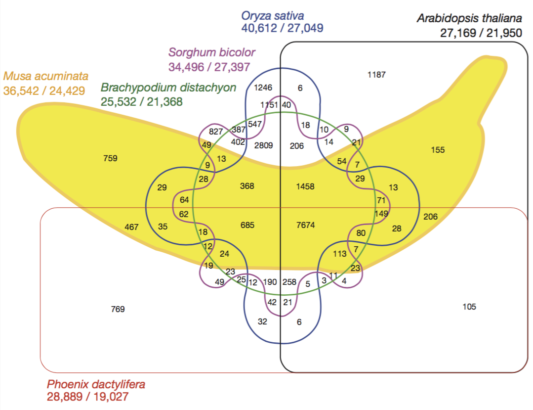
D’Hont et al, The banana (Musa acuminata) genome and the evolution of monocotyledonous plants. Nature 488, 213-217 (2012)

Example

UpSet plots

Let’s look at this from a missing data perspective. Each “set” is the missing/non-missing annotation of each variable in a data set, and we’re interested in when the missing data co-occur.

Code
gg_miss_upset(msleep) 

The msleep data

  • The left barplot gives the number of missing data for each variable (here showing the top 5)
  • The “barbells” show the different co-occurrence patterns
  • The top barplot gives the frequencies of each co-occurrence pattern

UpSet plots (R)

Using the UpSetR package

Code
library(UpSetR)
d <- msleep |> 
  select(vore, sleep_rem, brainwt, conservation, sleep_cycle)
d <- as.data.frame(is.na(d)*1)
upset(d, nsets=4)

Using the ComplexHeatMap package

Code
library(ComplexHeatmap)
m <- make_comb_mat(d)
UpSet(m)

UpSet plots (Python)

conda install -c conda-forge upsetplot

Code
from upsetplot import UpSet

msleep = pd.read_csv('msleep.csv')
d = pd.isna(
  msleep[['vore','sleep_rem','brainwt','conservation','sleep_cycle']]
)
D = d.groupby(['vore','sleep_rem','brainwt','conservation','sleep_cycle'], as_index=True).size()
D
vore   sleep_rem  brainwt  conservation  sleep_cycle
False  False      False    False         False          20
                                         True            9
                           True          False           9
                                         True            5
                  True     False         False           1
                                         True           10
                           True          False           1
                                         True            1
       True       False    False         True            5
                           True          True            3
                  True     False         True            7
                           True          True            5
True   False      False    False         True            2
                           True          False           1
                                         True            2
       True       True     True          True            2
dtype: int64
Code
UpSet(D).plot();
plt.show()

UpSet plots (Javascript)

A bit of a look to the future

The UpSet.js library is a JS re-implementation of the UpSetR R package. This is wrapped in htmlwidget and provided as the R package upsetjs

library(upsetjs) # install.packages('upsetjs')
tmp <- msleep |> 
  select(vore, sleep_rem, brainwt, conservation, sleep_cycle) |> 
  is.na() |> as.data.frame()
upsetjs() |> fromDataFrame(tmp)

Storytelling and Visual Narratives

Shifting gears

Motivation

General workplace skills

  • Empathy
  • Creativity
  • Problem-solving
  • Verbal communication
  • Written communication
  • Leadership
  • Negotiation
  • Technology

Data science skill

  1. Fundamentals of Data Science
  2. Statistics
  3. Programming and software engineering
  4. Data Manipulation and Analysis
  5. Data Visualization
  6. Machine Learning
  7. Deep Learning
  8. Big Data
  9. Model Deployment
  10. Communication skills
  11. Storytelling Skills

source

Humans are wired for stories

Stories are a survival mechanism across generations

Data storytelling is essential

  • Often, your jobs as a data-scientist is to be an effective communicator

  • There is more to communication than numbers on a paper

  • Stories are up to 22 times more memorable than facts alone

  • When in doubt, tell stories

Data stories appear to be most effective when they have constrained interaction at various checkpoints within a narrative, allowing the user to explore the data without veering too far from the intended narrative.

What is data story telling?

Components of a data story

Storytelling is abstract

It is not merely:

  • a technical matter of creating an image

  • designing the right chart

Rather it is:

  • the broader considerations that impact nearly every decision you make in the way you frame and present a project

Telling your data story

  • Know what you want to focus on
  • Don’t ignore data that contradicts your story
  • Investigate the data
  • Discover what stories are in your data

Story components

To tell a story you have to define a story

A story is how what happens affects someone who is trying to achieve what turns out to be a difficult goal, and how they change as a result

  1. Plot: how the story unfolds
  2. Protagonist: the main character
  3. Problem: a difficult goal for the protagonist to achieve
  4. Transformation - the “so what?”: how the protagonist changes as a result

Story linearity

  • Whether driven by time or logic, stories are typically is linear

Every story has a beginning, middle and end

Traditional vs data stories

source

Common visual narrative Genres

Standard Info-graphics

  • An infographic is a collection of imagery, data visualizations, and minimal text that gives an easy-to-understand overview of a topic.

Data Info-graphics

  • Data infographic are info-graphics that relies entirely or mostly on numbers to tell the story. This often includes data visualization, such as charts and graphs, but not always.

Research posters

  • Even research poster construction requires a narrative flow!!

Scientific papers structure

Developing knowledge content

Primary communication tools

Engagement levels-1

Engagement levels-2

Storytelling tips

Author vs reader driven

Repetition and Redundancy

The old adage on how to present anything:

  • Tell them what you are going to tell them
  • Then tell them
  • Then tell them what you just told them

Awesome data driven viz narratives

The Pudding’s process:

By Ilia Blinderman

  1. Storytelling is complicated
  2. Who is your audience
  3. Focus broadly or narrowly
  4. Complexity of the finding after analysis
  5. Progressing through the arguments
  6. Arriving at the conclusion

Scrollytelling (Bill Shander)

https://medium.com/nightingale/the-past-present-and-future-of-scrollytelling-10dd37dc1003

https://medium.com/nightingale/from-storytelling-to-scrollytelling-a-short-introduction-and-beyond-fbda32066964

https://medium.com/@billshander/how-to-tell-stories-and-weave-a-cohesive-narrative-with-data-a56dea3d1d67

Other resources and examples

https://opensourcelibs.com/lib/rolldown

https://elementor.com/blog/guide-to-scrollytelling/

https://www.visualstorytell.com/blog/what-is-visual-storytelling

https://mathisonian.github.io/idyll/scaffolding-interactives/

https://idl.cs.washington.edu/

https://distill.pub/2020/communicating-with-interactive-articles/

Break

Lets take a 10 minute break before moving onto the lab.